I’m going to be teaching an in-person workshop near Houston and put together this palette for the students and had to share. It’s designed for ease of mixing out in the field and the colors of the Texas Gulf Coast Prairies, but I bet it would make a great everyday palette as well.

I’ve been using it around Austin for the past month or so and have really been enjoying it.
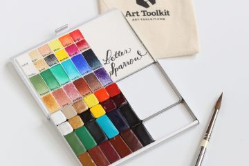
Here are the colors in the palette, starting from the top left:
Brands: DS = Daniel Smith, DV = DaVinci, WN = Winsor & Newton
- DS Buff Titanium – for sand, limestone, or mix with other colors to make opaque pastels
- WN Yellow ochre (DS yellow ochre) – dried grasses, beaches, mix with blues to make muted greens, use for yellow highlights in skies (will not turn green in skies unless you overwork it)
- DV Hansa yellow medium – basic yellow
- WN Winsor orange (red shade) (DS pyrrol orange) – the perfect color for Indian paintbrush flowers and sunsets!
- DV Permanent rose (DS Quinacridone rose) – primary “red” that’s great for florals; mix with any of the blues to make purple
- DV Quinacridone red (DS Quinacridone coral) – sunset skies, florals, mix with Hansa yellow for a lighter orange
- DS Sap green – a base green, add French ultramarine blue or carbazole violet to darken, Hansa yellow medium to make it yellower or yellow ocher for a sandblasted dusty green
- DV Cobalt turquoise (DS cobalt turquoise light) – use for the color of the sky along the horizon, mix with French ultramarine for the teal of the ocean, mix with rose to make a bright purple
- DV French ultramarine blue – the sky above the horizon, mix with
- DS Carbazole violet – gorgeous purple, dries lighter; also great for shadows
- DS Transparent red oxide – browns for grasses, tree trunks, mix with French ultramarine for a beautiful gray for skies
- DS Lunar black – super granulating color that adds amazing texture. Mix with other colors to get different shades (Hansa yellow medium will get a neat green)
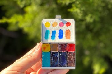
I like to have dedicated mixing areas with pinks, oranges, yellows in the top, greens in the left mixing pan, and blues in the right mixing pan. You’ll find your own favorite spots!
Looking to purchase an Art Toolkit, Pocket Palette, or mixing pans? Use code LISAFAN10 for 10% off! I’ll receive a small commission at no charge to you if you do — thank you!
I’ll report back with photos from the workshop when I get back next week — it’s my first in-person workshop since 2019! I’m so excited!


5 Comments
Bob Cochran · April 12, 2022 at 6:34 pm
Hi Lisa, the Pocket Palette arrangement you have with the two mixing pans is quite interesting. I will certainly have to experiment with mixing pans. I haven’t thought of adding them to a pocket palette.
I am very interested in seeing photos from your workshop. Conducting the workshop must mean a really big personal commitment for you — it looks like a long drive, to begin with, and I am guessing you put in quite a lot of preparation time. Like experimenting with this palette for a month before the students see it. I am very much impressed with the preparation work that I sense.
Bob Cochran · April 15, 2022 at 6:14 pm
Hi Lisa, I did go ahead and purchase some pans for the Pocket Palette so I can duplicate the configuration shown in this article. If it seems to work well in the Pocket Palette that came with my Art Toolkit, I’ll order a second Pocket Palette. I’m looking forward to trying out this interesting pan arrangement. I was also wondering….do you use a “bridge” when painting?
Lisa Spangler · April 16, 2022 at 10:56 am
Hi Bob! I’d love to hear how you like this setup! I mostly paint out in the field so I don’t use a bridge.
Dory Rice · May 10, 2022 at 4:10 pm
Hi Lisa, Thanks for your palette notes. I really appreciate it that you don’t just list the colors but also give ideas for how you use them in mixes. Very helpful!
Lisa Spangler · May 10, 2022 at 4:45 pm
Hi Dory! You’re most welcome! I know when I was first starting with watercolor I always wanted to know what the colors were for, so that’s why I try to post them here! 🙂